Please see the documentation for this Add-on on in the repository github.com.
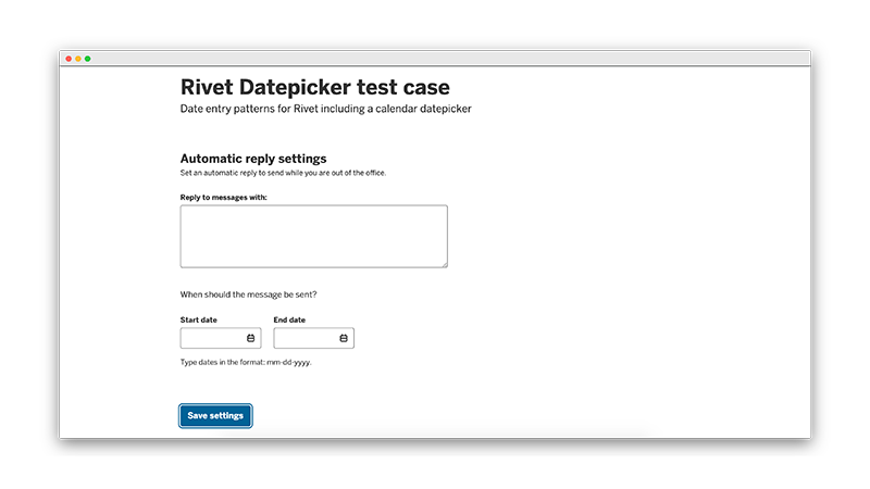
Screenshot
About Rivet Add-ons
Rivet Add-ons are components, plugins, and other utilities that can be included in Rivet projects on an as-needed basis.